Taste of Chicago
Event Brand + Web Design
Event Info
Taste of Chicago is a three day annual food festival held in Grant Park, that features a wide selection of local restaurants and food trucks, highlighting the city’s culinary diversity. The festival also includes live music from both national and international artists, along with “SummerDance” sessions that cover a variety of dance styles.
Inspiration
The identity draws from Chicago’s classic typographic style, which is often a mix of expressive script and bold sans serif fonts. That felt like a natural starting point for creating something both familiar and approachable. I wanted the design to carry a sense of nostalgia but still feel fresh and engaging, so I leaned into a bright, eye-catching color palette.
I also looked to the visual language that’s long been part of the city’s everyday life. Vintage signage, classic baseball prints, gritty textures, and industrial type helped ground the design in something authentic and tied to the character and pride of Chicago’s neighborhoods. The red, blue, and cream palette connects to the city’s flag and sports culture, reinforcing that sense of place. Overall, the direction became a way to honor the city’s layered identity while keeping the tone warm and accessible.
Reason for Rebrand
During my initial research, I noticed a lack of visual cohesion and a limited online presence. Given that Taste of Chicago is one of the city’s most popular annual events, my goal was to create a clearer, more recognizable brand identity. I focused on making key event information more accessible while designing visuals that could appeal to new audiences, especially those who are unfamiliar with the festival and what it offers.
Style Guide
Home Page
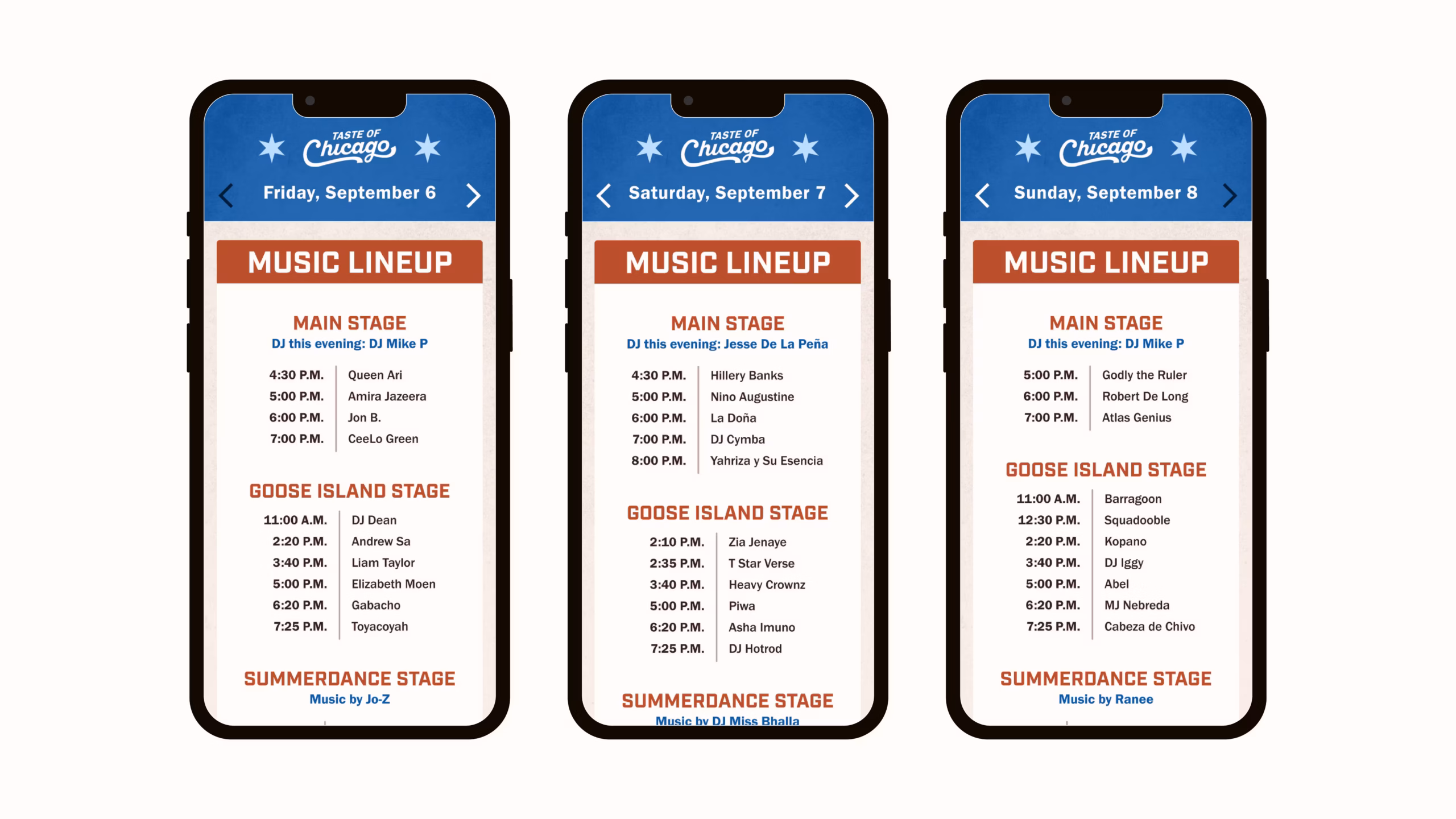
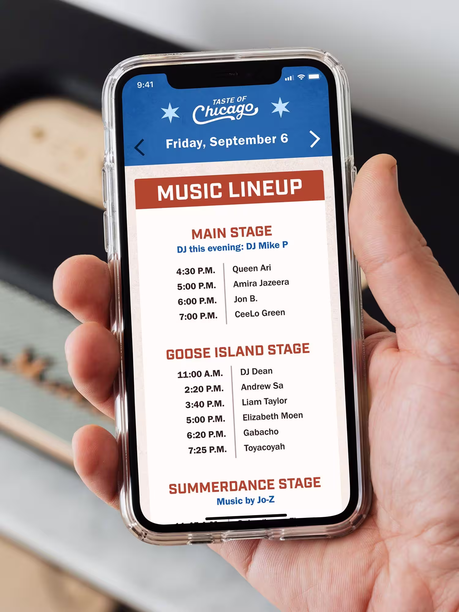
Music Lineup
Slideshow


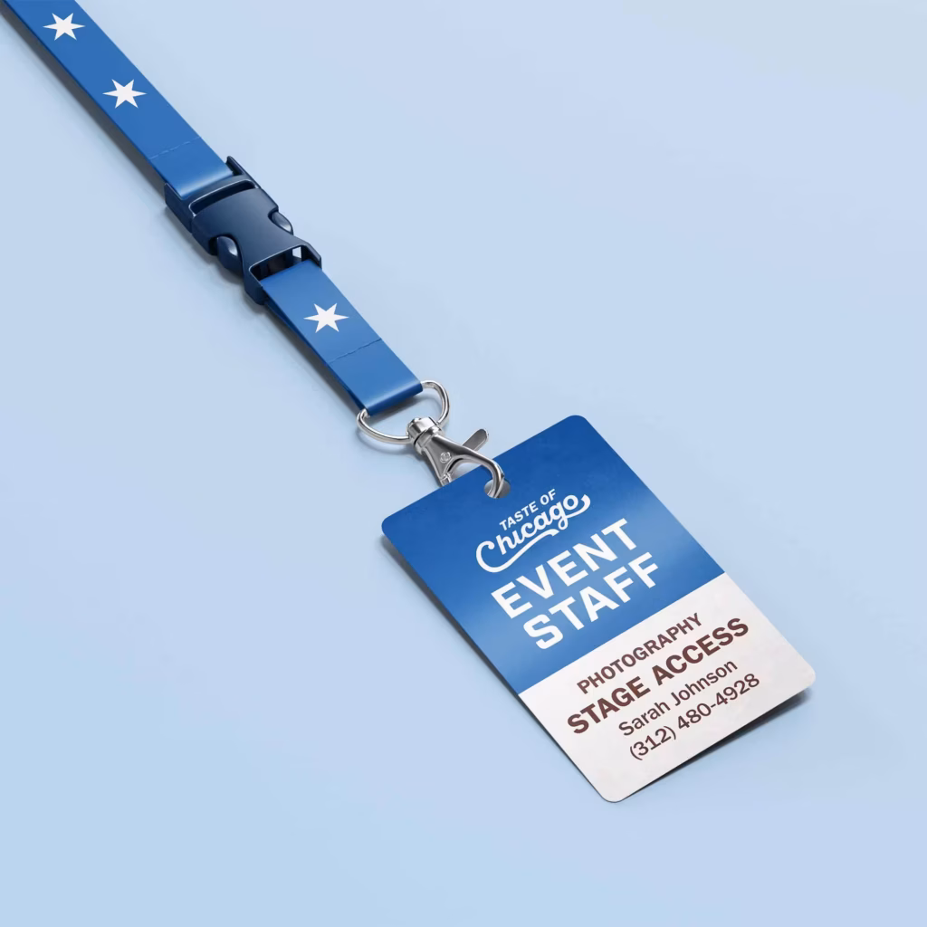
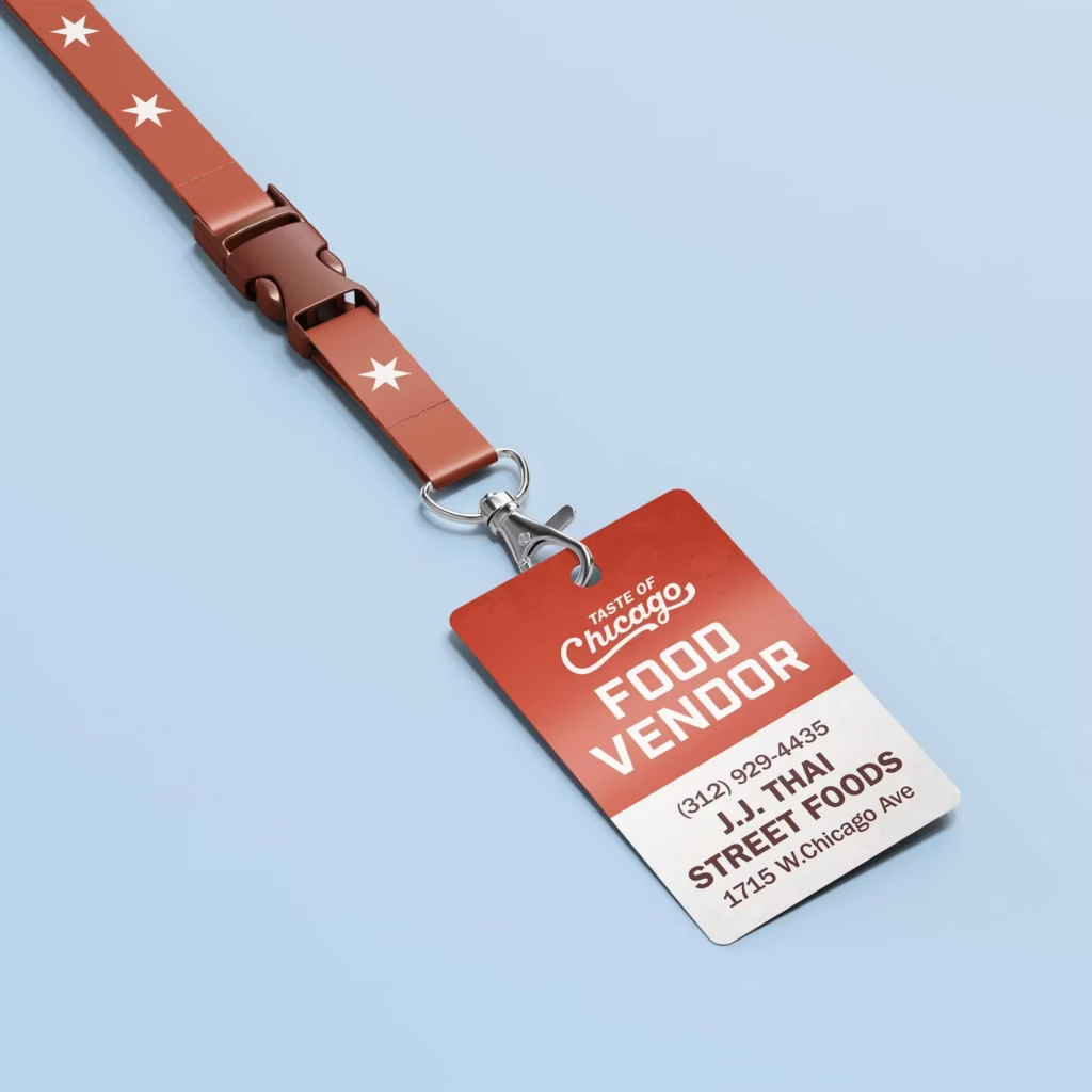
Badges
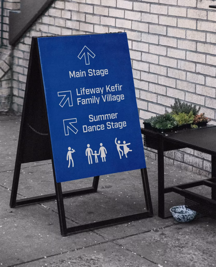
Wayfinding